


Time Travel Art Machine: Making the John Cena WWE 2K23 Icon Edition Cover
Now you can see it.
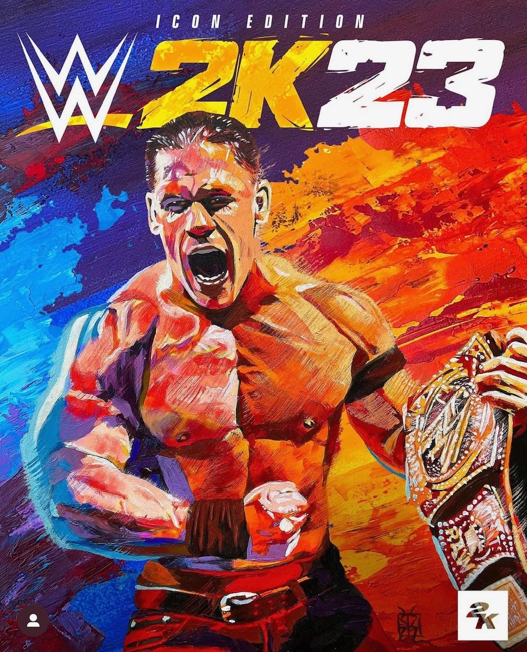
Now that the WWE 2K23 Icon Edition game is out there for download, I thought it’d be fun to share with you my process for painting the cover. Because of the nature of how it would be used for various promotional purposes, 2K asked me if I could actually paint it in two separate layers, the foreground and the background. Being the overachiever that I am and knowing how I wanted it to look I said I’d actually do THREE layers! So here’s each of them, painted with acrylics on three pieces of 15” x 20” illustration board.
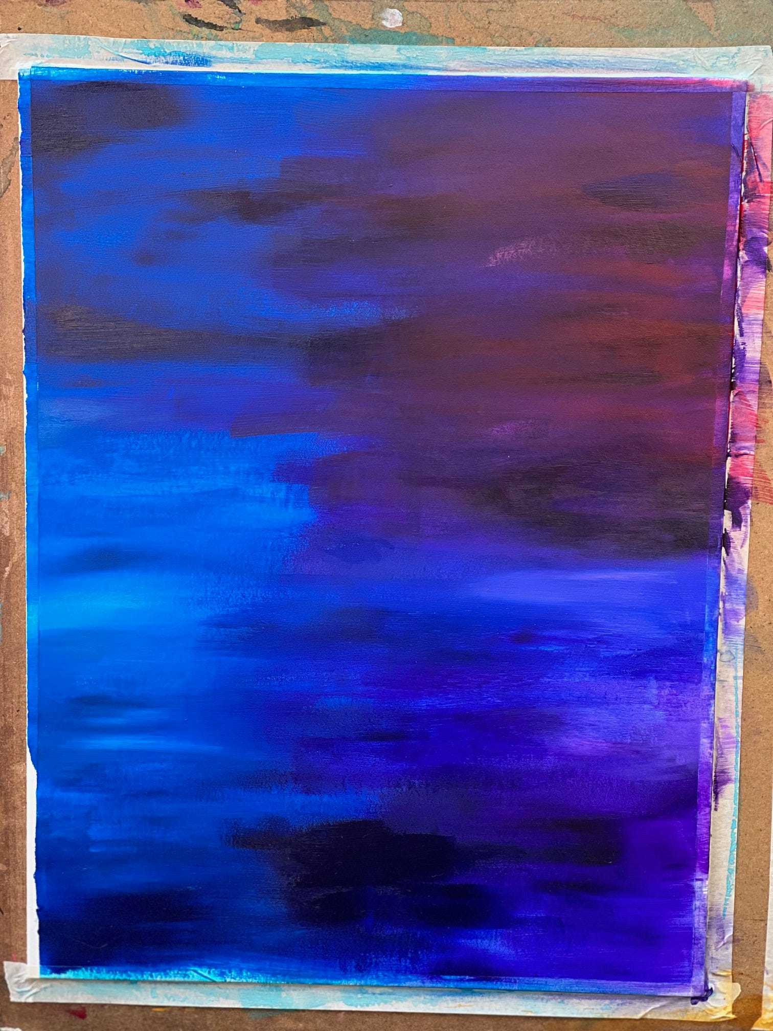
I started with the background, using a large flat brush to move cool colors side to side. 2K had the great idea to add a little warmth to the upper right corner which I added in as well. I had a large board that I taped this and the foreground both to so that I could constantly look back and forth to make sure my colors were balancing.
That was the biggest challenge of this project, that I didn’t know how it would look until I composited them all together. Normally I’m working that out as I go on a painting, but with this being on three surfaces I had to trust my abilities to get through.
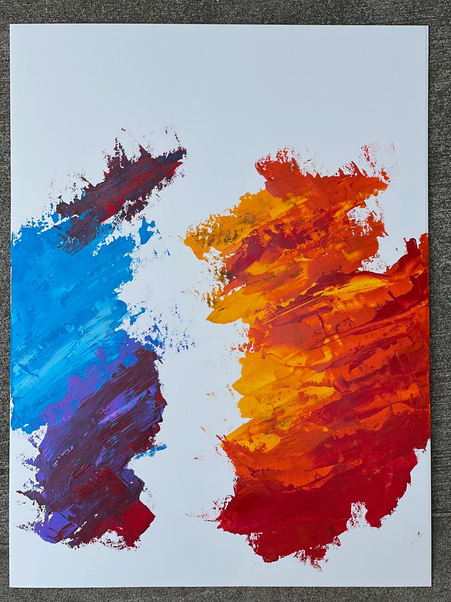
The second layer is what I call the ‘energy layer’, where I used a palette knife to apply and move around more acrylic paint, getting a different look and feel from what I had done with the far background. It also creates a little sense of depth to the piece once John’s figure is added in.
You’ve probably noticed in the Icon Edition commercial (my art is featured in TV commercials. WHAT.) that the 2K graphics team used these first two layers for a lot of the animation, and fans have also put them behind their own fantasy cover creations. Pretty fun!
Finally, a blank layer! I BEAT YOU TO THE JOKE.
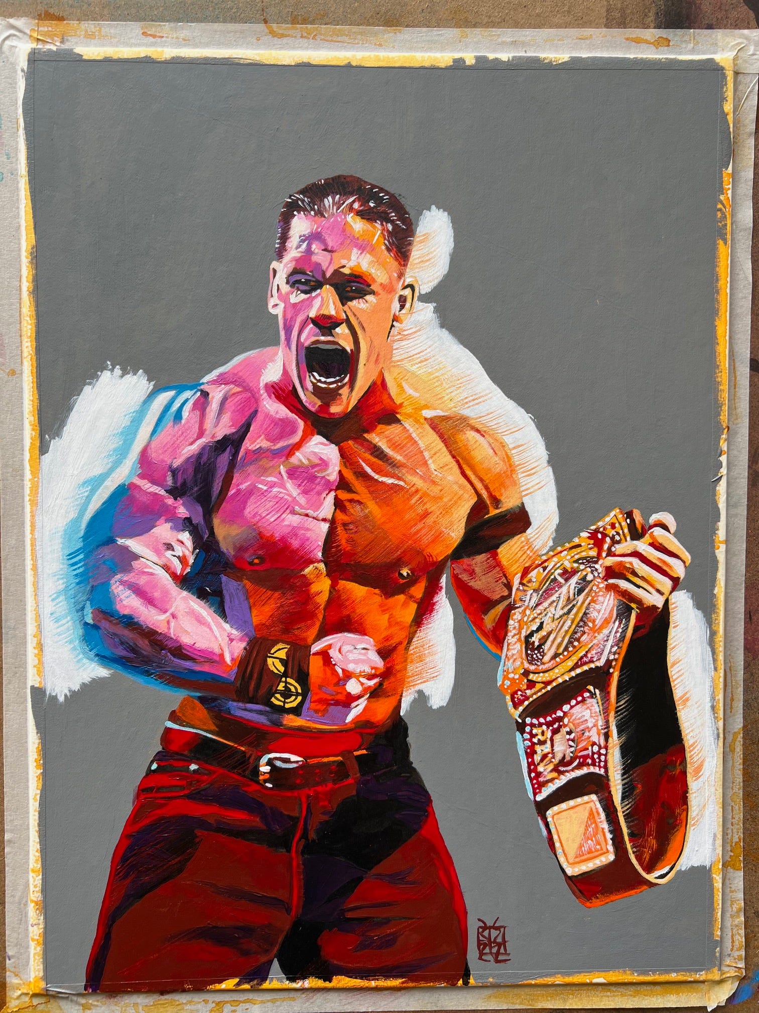
For John’s figure I initially played it safe, figuring that for a project like this that they wouldn’t want me to really push things stylistically like I would for my own work, but the team at 2K were quite the opposite and loved what I had done in other paintings with a grainer brush and asked for more of that.
When compositing it all together, 2K asked me to tilt the background to match the diagonal angle of the grainer brushstrokes, which I think took the energy to a whole other level. We even tilted John a little more to add to the whole dynamic. It was a blast to see it all together with the logos. My first thought was, “Hey, I made that!”
I can’t speak highly enough of how well the team at 2K treated me throughout this process and since. Their notes were all very well-thought out and added to the quality of the finished product and I think I came out a stronger artist than I was before doing it.
I also want to make a special point to note that they kept my signature on the work, something that might seem like a no-brainer but a lot of other companies out there don’t show the same respect to artists. 2K went above and beyond to do this the right way and I respect them greatly for that. It’s important not just to me, but to every other artist out there.
Love you more,
Rob


Really beautiful art! Congratulations!!it’s amazing. You really paint the perfect Cena.
Great Work!
This is stunning and amazing to see the breakdown, where you were at with each stage and how it was designed. As soon as we saw the cover we knew it was a ‘Schamberger’. Gonna buy the physical copy of the game to have this one unless there’s a print coming out.
Really digging this one Rob, you seem proud of it too which is great. Keep being rad, hoping to catch you at ‘Mania.