


SHOP TALK: Rob Schamberger Newsletter 14JUL24
Wheels turnin' round and round.
Hi. My name's Rob Schamberger. I'm that guy who paints rasslers. And other stuff. You go back, Jack, do it again.
WORDS
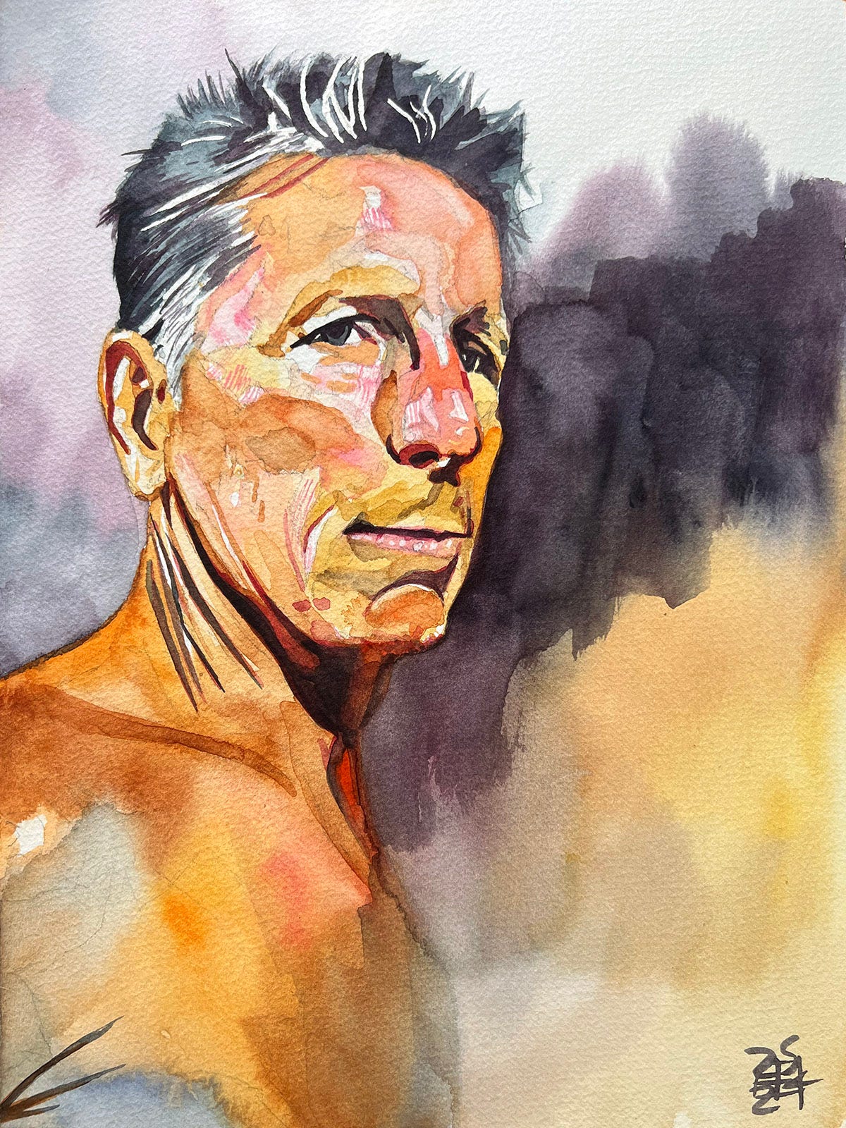
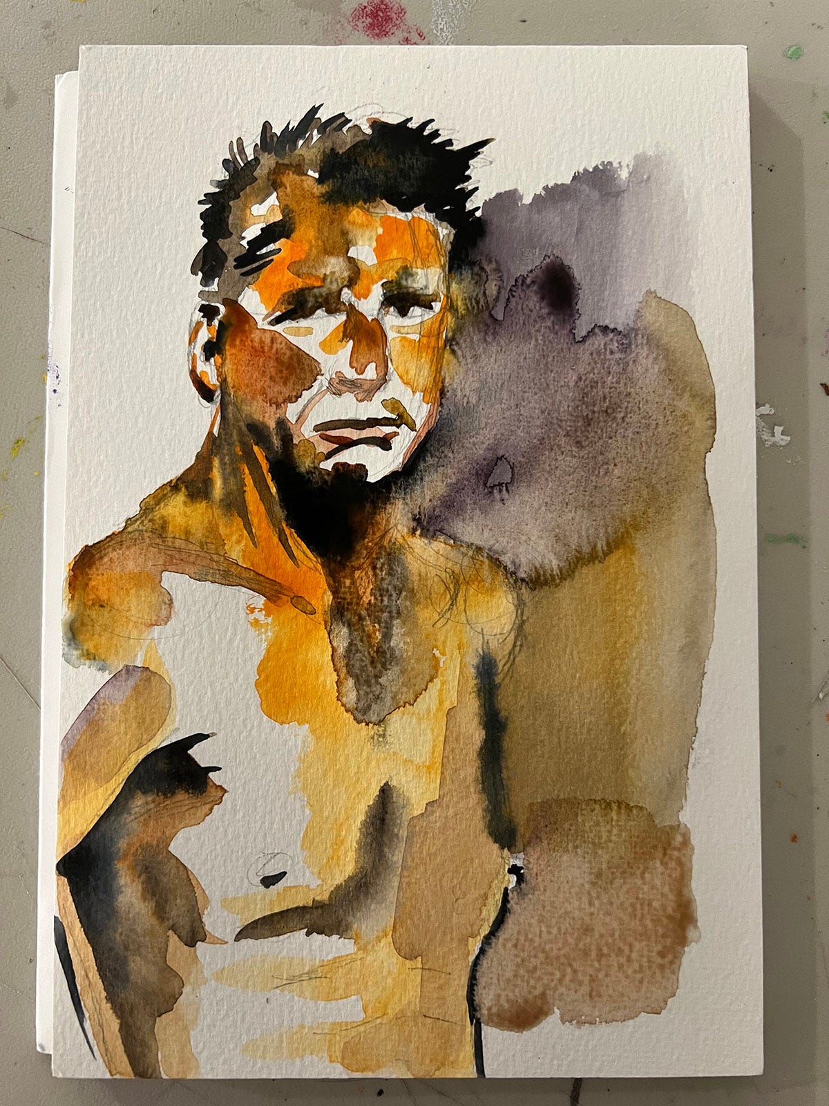
I went to the monthly figure drawing group I attend on Tuesday night and we worked with our regular model, Doug. He’s a fantastic subject with some great classical features who always does some tremendous poses. There was one in particular, with the way the light hit his face, that I wanted to revisit in the studio. Above is the finished painting, and here’s the 20 minute study I did that spoke to me:
It was really reminiscent of the lighting on our models in Florence, so I knew exactly how I wanted to do the painting. It’s way more polished than the quick sketch, but I feel like I kept a lot of the energy of the sketch. That’s easy to lose as I get more deliberate about my brushstrokes.
Here’s a few other pieces from the session I was happy with:
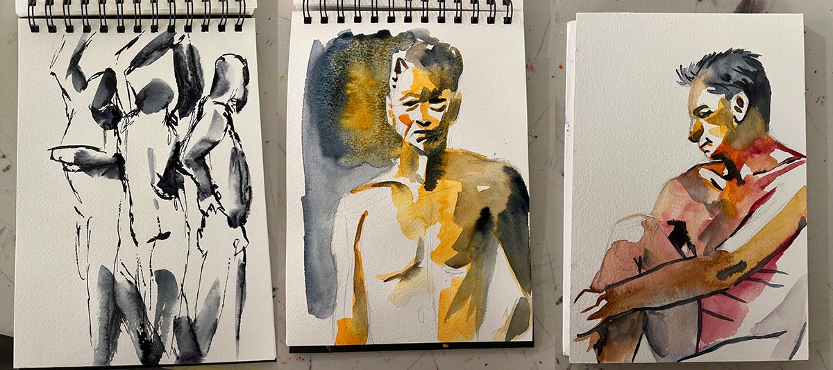
Three one minute gesture drawings done with a parallel pen and water-soluble ink, a ten minute color sketch, and then a twenty minute sketch. Diana, the lady who runs the session looked at everything at the end of the night and said, “Man, your time in Florence did a lot for you.”
It was one of the rare times where I enjoyed everything I did. Normally there’s some duds where I’m either not in the zone or I’m experimenting with something that doesn’t quite work out. Even though I was pushing myself, I felt good about the work. I’ll take that win!
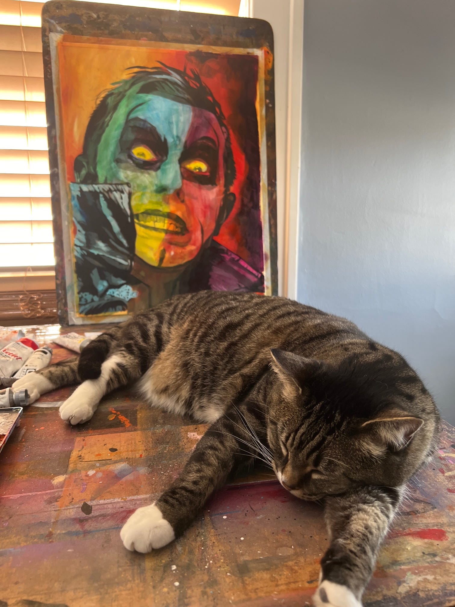
Here’s a preview of Thursday’s new cursed Danhausen painting. Kima worked really hard on it, obviously.
UPCOMING AEW/PWT PAINTINGS
Danhausen - Very signed, very evil.
Adam Copeland
Malakai Black
MJF
Britt Baker, DMD
Card subject to change.

Rob’s Art on ShopAEW
###
Rob and Jason Arnett's novella Rudow Can't Fail!
###
Rob’s prints and shirts at Pro Wrestling Tees
###
Instagram
Threads
Cara
YouTube
EMOTION SERIES PROGRESS
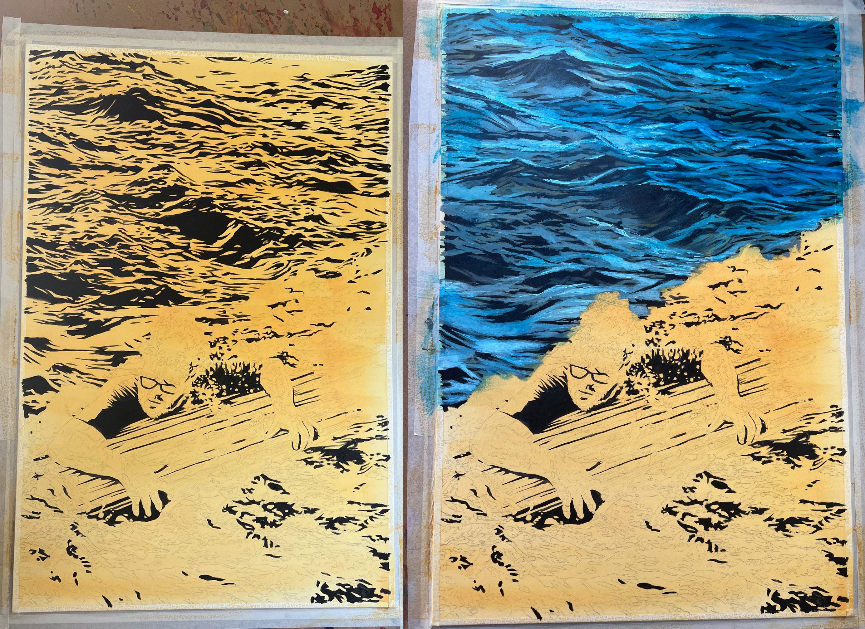
I started in on my next Emotion Series painting this week, a project that sprang from my work in therapy where I’m making different pieces to depict how I experience various emotions. This new one is for ‘Sad’.
I don’t know if it’s my background in comic book illustration or the idea of working from dark to light, but with my acrylic paintings I typically start with the black areas. I view them as reference points, as a sort of road map for where I’m going with the painting. So with this one, an ocean scene, there was a lot more little detail than what I customarily have at this stage and I’ll admit, it was kind of maddening covering it all up as I went along.
This is also my first time depicting a body of water with my approach to acrylic glazing and I’m loving the results so far. Such lush colors.
Here’s the others I’ve made so far for the collection:
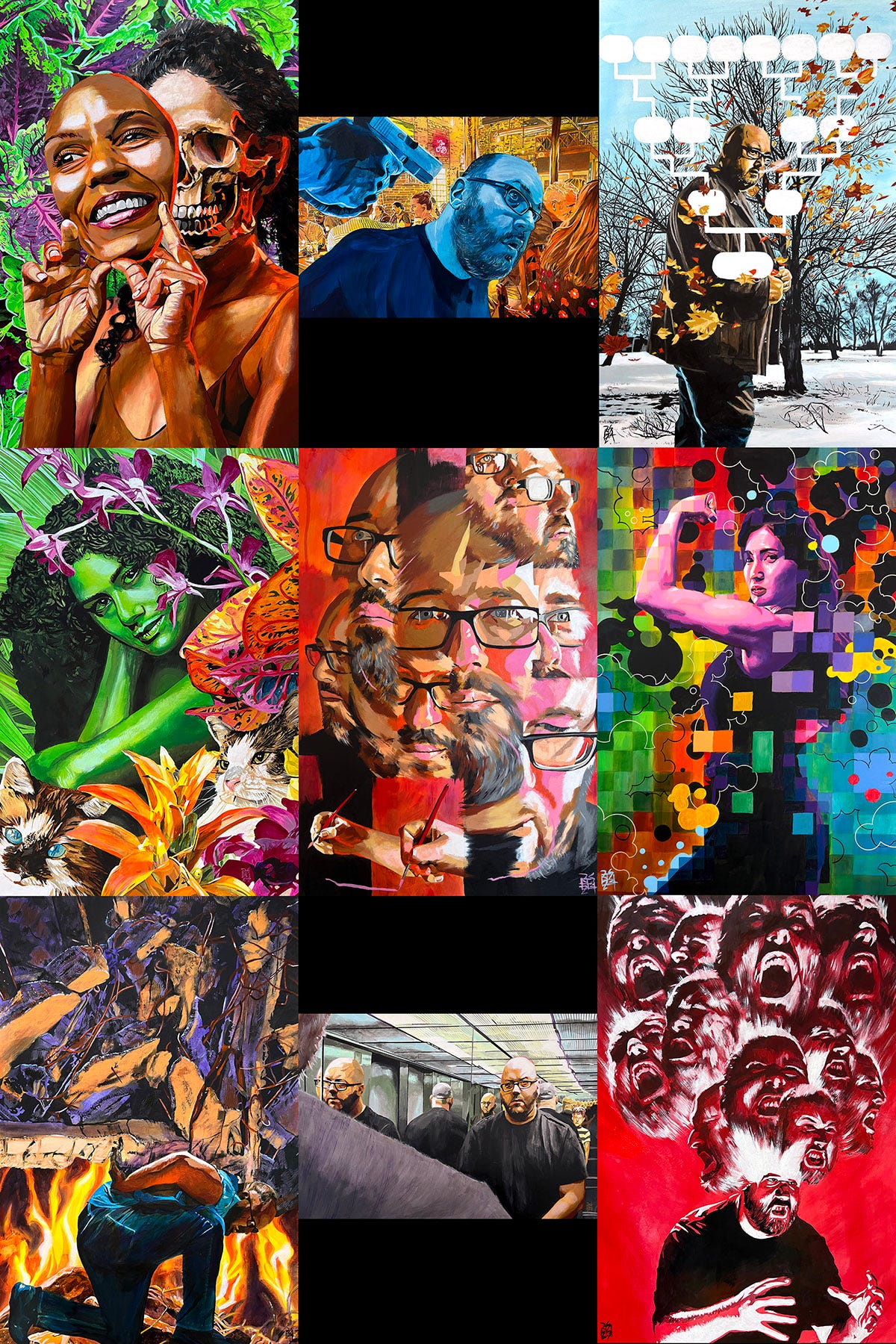
Excited, Alone, Dislike, Loving, Interested, Confident, Overwhelmed, Embarrassed and Anger.
There’ll be two more after this new one is done and then I’m going to look into doing an initial public showing of them with a focus on inviting mental health professionals.
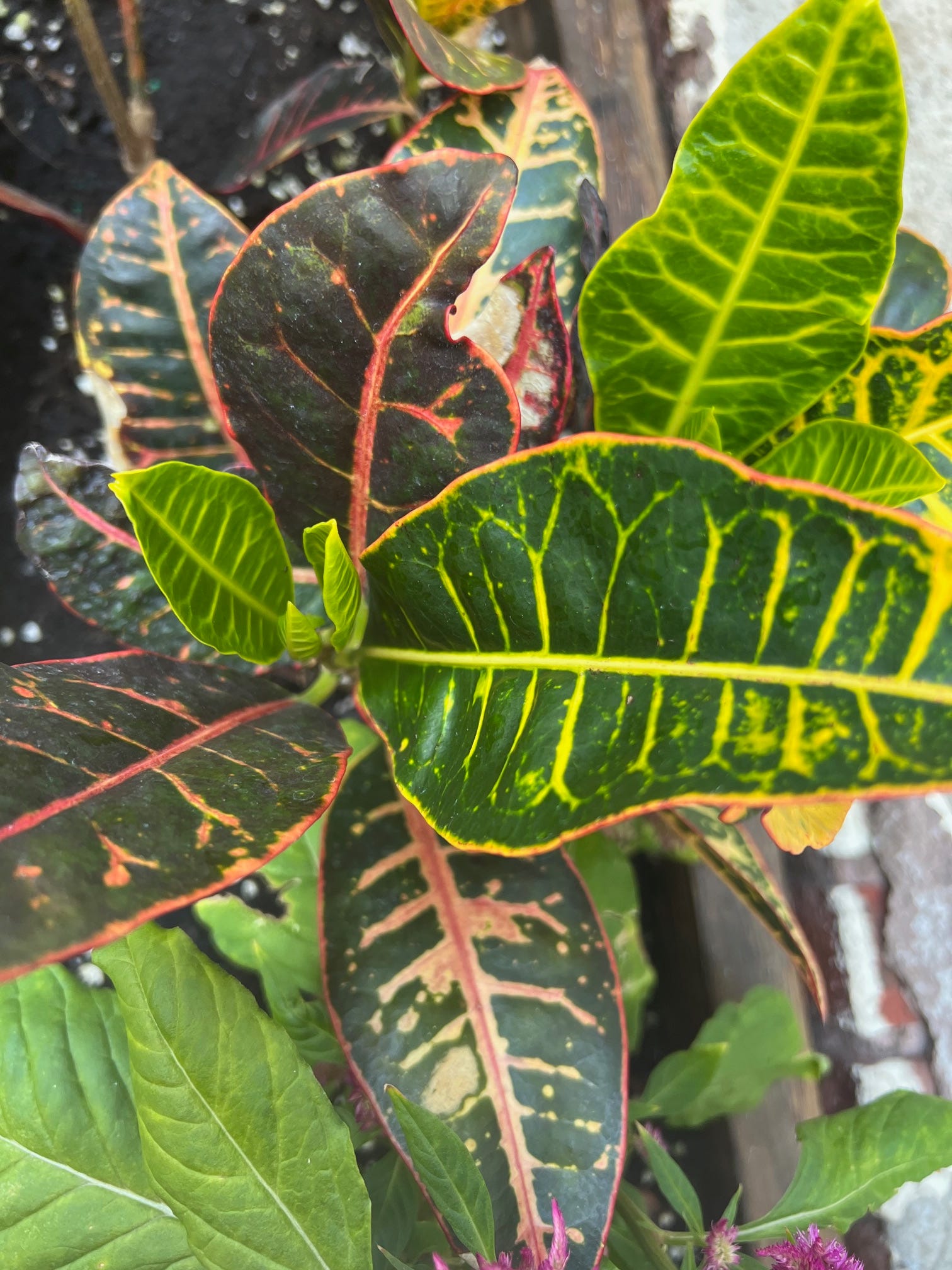
Something about a croton’s leaves never fails to captivate me. The combination of order and chaos, I think. The pattern and the randomness.
YOU GOOD?
It doesn’t show that way because my prints are all limited editions, but by the numbers I think I’m a top-seller on PWT/ ShopAEW now? Not bad! It’s like, who was Marvel Comics’ biggest seller in the 60’s, Spider-Man or Jack Kirby? Obviously I’m doing nowhere near Jack’s numbers nor the cultural relevance, it’s an extreme example, but…you know. Something to work towards.
Coming from the comic book world I feel like there’s three main ways to market a comic: The character, the story, and the people who made it. Probably the best example of this is The Dark Knight Returns: Batman comes out of retirement one more time to help Gotham City in its darkest hour, written and drawn by Frank Miller with finishes by Klaus Janson and lush colors by Lynn Varley. It’s no wonder that 40 years since its publication that its still a bestseller.
Simply having a Batman comic guarantees a certain number of sales, and DC Comics and comic shops know how to talk to their customers about Batman. The story of DKR is a captivating one and wholly original at the time it was first published, generating interest for readers to see what happens. And then the creative team headed by Frank Miller also guarantees a certain number of sales, the publisher and the retailers know how to talk about them, and the audience wants to see them do this story with this character. All of this works hand in hand.
Wrestling merchandise is the same way, in my mind. An art print of your favorite wrestler, of a particular moment, by a name artist, for instance. The more each of these three marketing points is elevated in the fandom’s consciousness, the more likely that item is to sell. For instance, I have an upcoming Adam Copeland painting focused on his AEW debut. That’s easy to sell, right? It’s someone that the audience has a decades-long relationship with, in a memorable moment, done by an artist the audience has a decade-plus relationship with.
It’s not just an ‘Adam Copeland art print’, which doesn’t feel all that special in and of itself. It’s an Adam Copeland painting by Rob Schamberger with a story to it. That’s got legs.
I’m grateful to be working with a group that shares this mentality and I’m excited to see what we grow this relationship into.
Love you more,
Rob
Great. I'm gonna have Steely Dan stuck in my head all day. Not like that's a bad thing.