


SHOP TALK: Rob Schamberger Newsletter 01OCT23
There's a gateway in our minds.
Hi. My name's Rob Schamberger. I'm that guy who paints rasslers. And other stuff. Showing warmth to everyone you meet and greet and cheat along the way.
LGTBQ ATHLETES
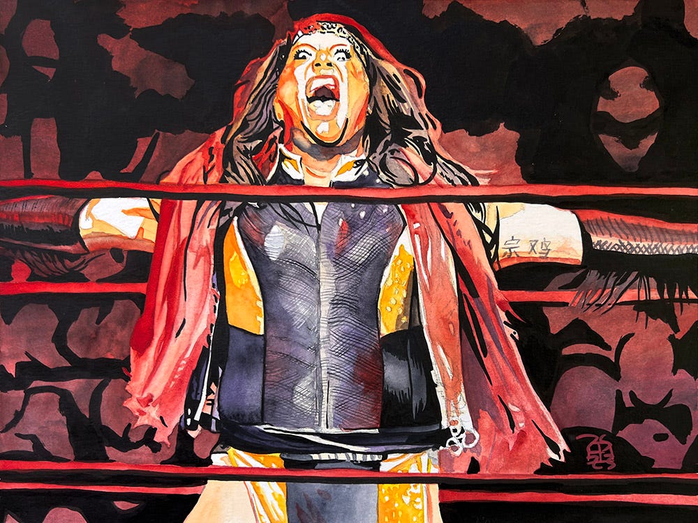
Nyla Rose
Ink and watercolor on 12” x 9” watercolor paper
The first openly trans wrestler to win a championship in a major American wrestling promotion when she won the AEW Women’s Championship.
You KNEW I had to paint a wrestler for this series, right?
UPCOMING WWE PAINTINGS
Cody Rhodes acrylic
LA Knight. YEAH.
Rhea Ripley
Card subject to change.
Hundreds of prints and paintings at Schamberger Labs!
Rob and Jason Arnett's novella Rudow Can't Fail!
###
Rob’s prints on WWE Shop!
###
Instagram
YouTube


WHAT I LIKED THIS WEEK
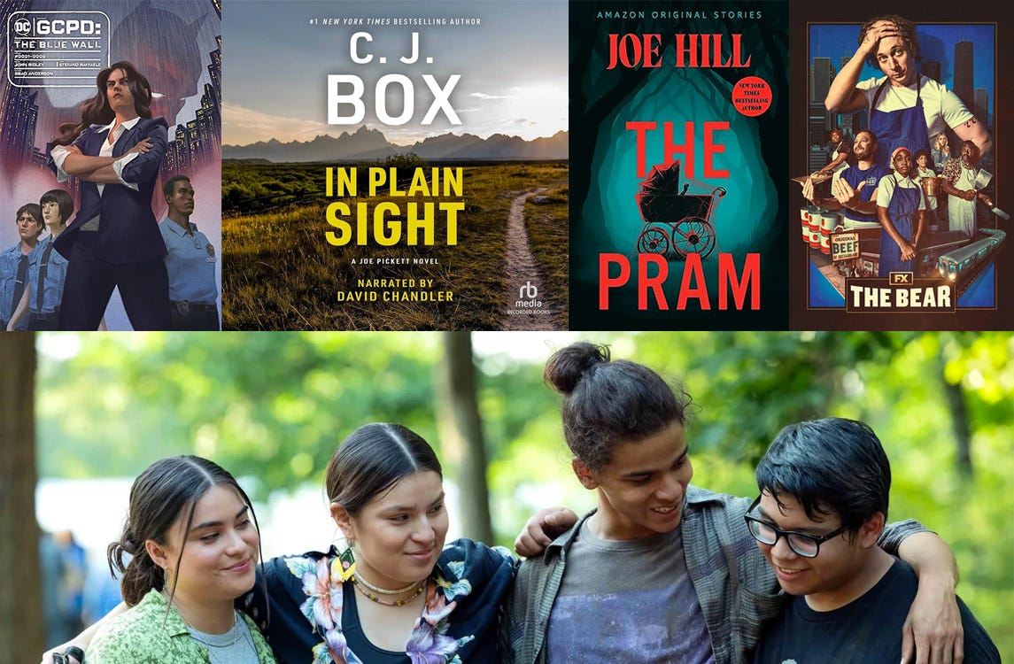
GCPD: The Blue Wall by John Ridley and Stefano Raffaele was a pleasant surprise. Like, “Okay, it’s a Batman book, neat, never read one of those before.” Except it’s absolutely not that at all. Written by John Ridley, who’s written a couple small things like the movies Three Kings, Red Tails and 12 Years a Slave, this is instead a brilliant look at how it would be to be a police officer in Gotham City through the lens of today’s society. Like, extrajudicial activities from cops and vigilantism aren’t looked highly upon anymore, right? So, what’s it like to be the new commissioner trying to modernize this police force, and what’s it like to be fresh out of the academy and thrust into this reality? It’s brilliantly done, and brought to beautiful life by Raffaele’s art. It’s hard to do something new and interesting in the Batman mythos, but this book does exactly that.
In Plain Sight by CJ Box brings a lot of past elements from the Joe Pickett books back to the surface in a truly terrifying way, with serious consequences. Someone is out to ruin Pickett and his family’s lives and may do just that.
The Pram by Joe Hill is a new short story from Hill just in time for spooky season. A couple moves to Maine from New York to escape recent trauma, but as anyone in therapy knows you always end up bringing that trauma with you. Except here it’s in a truly horrifying fashion as we’ve all come to expect from Joe Hill.
Katy and I finally started watching The Bear and are loving it. We’ve finished season one and are a few episodes into season two. I worked as a line cook for a few years in my teens and the tension and stress is exactly how I remember it, especially in a family restaurant. We’re both yelling “Corner!” as we walk through the house now.
The Reservation Dogs series finale was truly perfect and cemented this as one of the very best shows ever made. It’s about heritage, community, identity, filling roles and the families that we choose. This third season especially felt like one big story unto itself and I really want to watch it all again in one sitting. Couldn’t have been better. No notes.

Let’s take a moment to reflect on these two absolute legends.
Smile or somethin’.
YOU GOOD?
Thought I’d do a little process talk here in case you’re a fellow artist or someone who just enjoys such things.
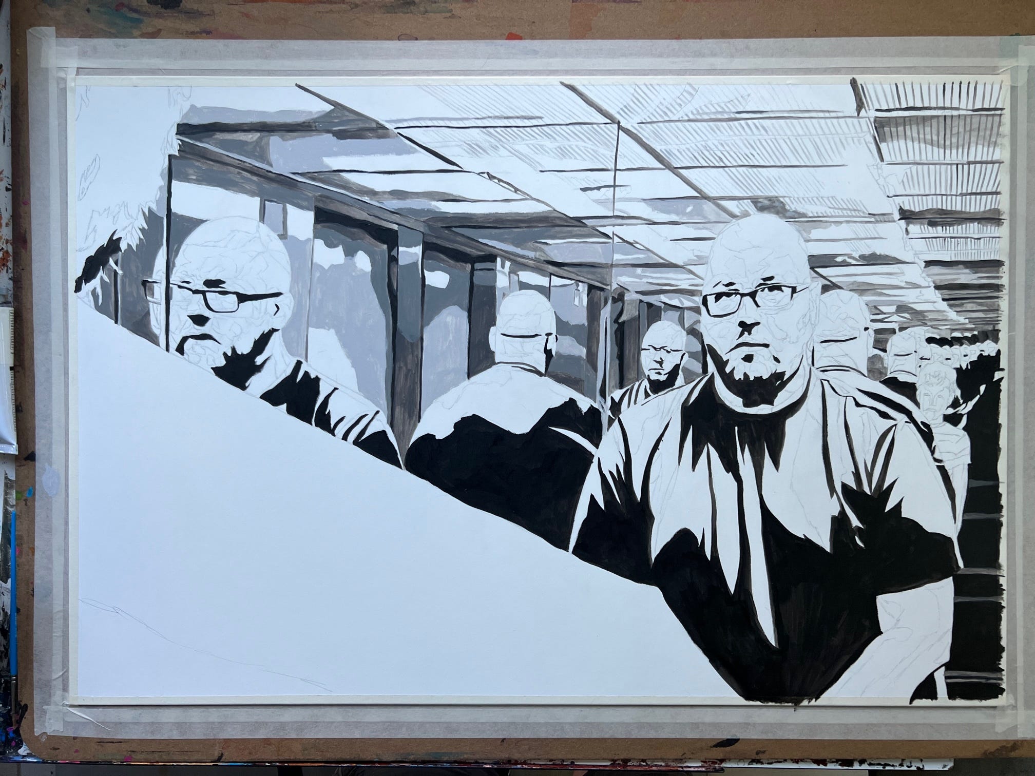
I’m working on my next ‘Emotions’ painting and it’s a really complicated piece where I’m standing between mirrors, creating an infinity loop. I was actually able to shoot the reference for this in the elevator at my office building! The ceiling of the elevator (is that what you call it? A ceiling? I have no idea. The top? Ceiling works for me.) is where the lighting is and there’s slatted panels to diffuse the lighting. And those slotted panels are DIFFICULT to paint. Lots of lines. Straight lines.
I first added some black acrylic paint for all of the deepest shadows and then did some rough underpainting with shades of grey for the background, just to work out the values before I add color. That’s the stage pictured above.
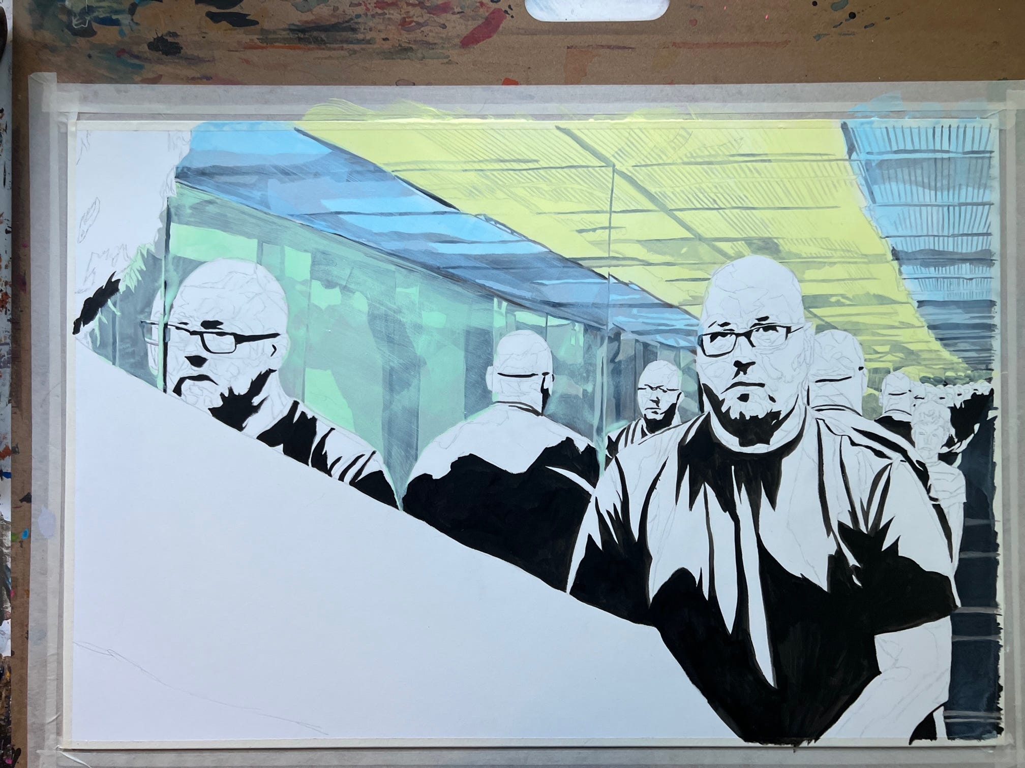
I then added some glazing medium to some light bismuth yellow, light phthalo blue and light phthalo green acrylic paints and applied them over those areas. I’ve started using Golden Acrylics more and more, especially with glazing. I like the consistency of the pigments and the predictability of how the paint will apply.
So, what the color does here is where the white surface was is now the saturated color while the grey areas are more muted. If you’ve used the ‘multiply’ layer setting in Photoshop, it’s a similar effect. It gives a radically different look to acrylic paint, which can sometimes be overly vibrant. However, it’s more of a starting point than a finish.
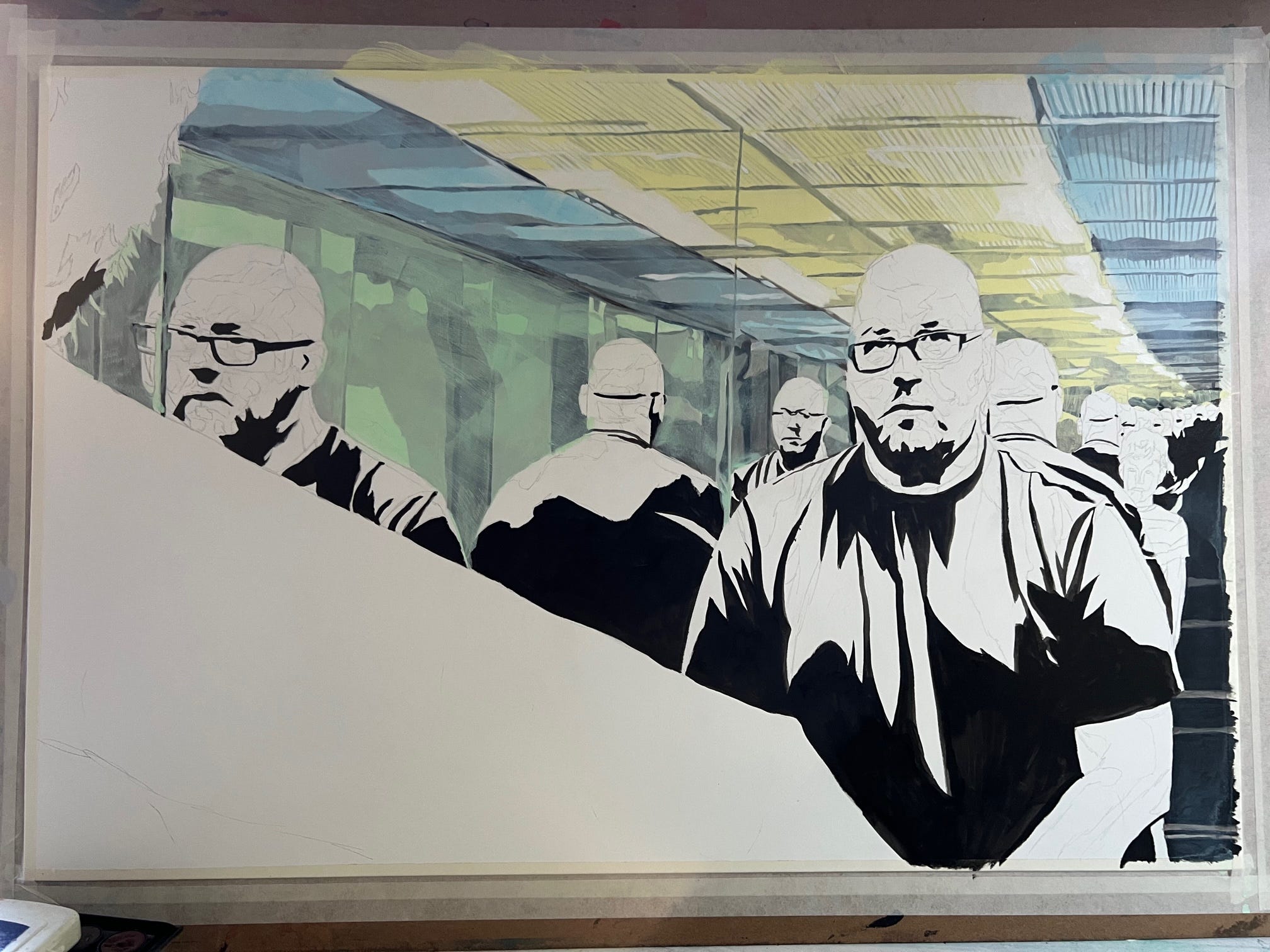
As you can see here, I started adding some white to the ceiling, letting the color and its tones from the underpainting do their job and accentuating them. Working on it, I see that going forward I’m going to need to change that yellow to more of a light green, which means all of that white paint (about two hours of work on that portion) will have to be reapplied. I’ll also deepen some of the shadows to really represent that slatted texture appropriately.
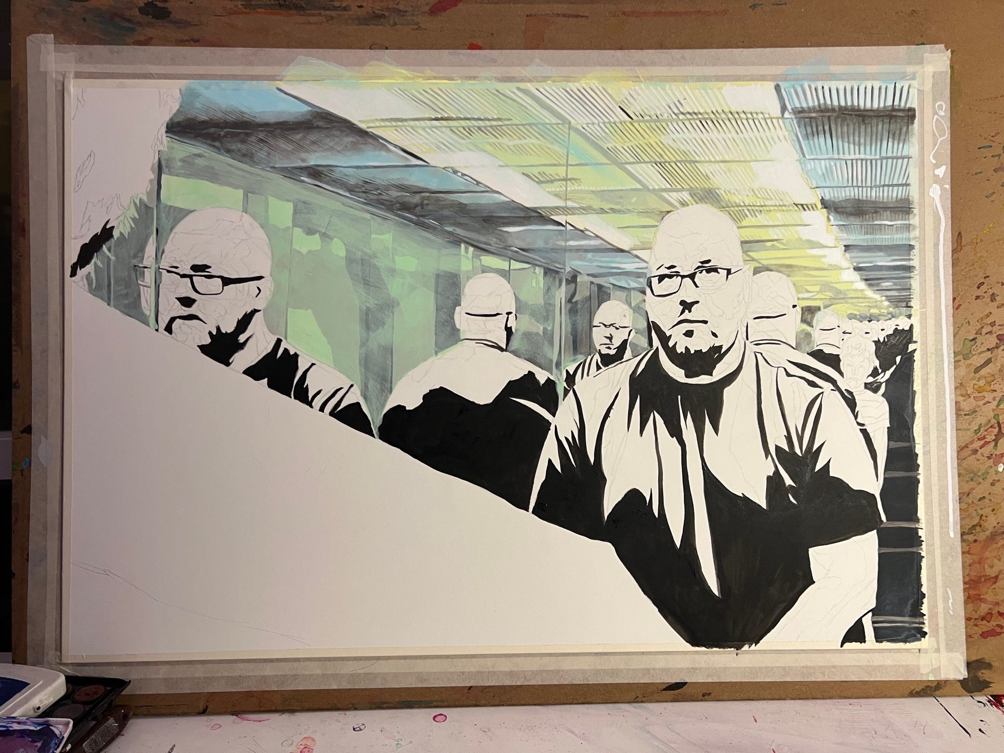
Seems like a waste of time and effort, but that’s the whole acrylic painting process: Figuring out what’s working, what’s not, why, and making appropriate changes as you go.
Kind of like life.
Love you more,
Rob
EXCLUSIVE PAID SUBSCRIBER CONTENT
Paid subscribers this week will get an exclusive 25% off discount code. WE ARE GO FOR PAYWALL.
Keep reading with a 7-day free trial
Subscribe to Rob Schamberger Newsletter to keep reading this post and get 7 days of free access to the full post archives.